
Candy Store Layout: How to Plan Customer Flow, Displays and Back-of-House Space
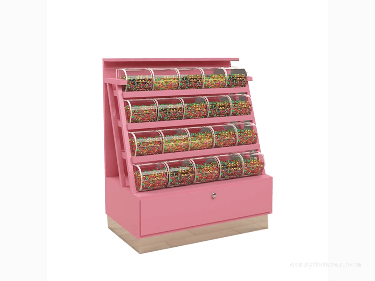
A practical candy store layout guide for arranging entrances, feature displays, bulk candy, checkout, storage and replenishment without making a small shop feel crowded.
A good candy store layout answers three questions
A useful candy store layout makes the next customer action obvious, keeps the best products visible and lets staff maintain the store without disrupting shoppers. Those goals are connected. If the entrance is blocked by a feature display, customers hesitate. If the checkout is hidden, the queue spreads into the shopping path. If reserve stock is far away, replenishment becomes slow and visible.
Start by drawing the customer journey rather than drawing furniture. Mark where a shopper enters, notices the first message, chooses a direction, compares products, reaches the service point and exits. Then draw the staff journey: receive, store, refill, clean, serve and close. A layout is strong when the two journeys support each other instead of competing for the same narrow route.
There is no universal best plan. A mall kiosk needs visibility from several sides; a narrow shop needs a disciplined wall strategy; a larger destination shop may benefit from islands and themed rooms. The right plan is the one that fits the site, assortment and service model.
Draw the fixed constraints first
Before placing a single display rack, mark the entrance, exits, columns, doors, fire equipment, electrical points, water or drainage, ceiling changes, landlord boundaries and delivery route. These items are not always movable, and they often determine what looks like a realistic layout.
Measure the clear usable area rather than copying the lease area. A column may remove a surprising amount of display length. A door swing may affect the first fixture. A low ceiling may make a tall tower display feel heavy or block a sightline. A delivery route may limit the size of a fully assembled cabinet even when it fits the finished shop.
Keep a second drawing that shows the empty space. It becomes the reference for circulation, service access and future changes. When a supplier proposes a custom unit, compare the proposed footprint to this drawing instead of judging the unit in isolation.
| Information | How to record it | Layout decision it supports |
|---|---|---|
| Customer approach | Photographs or observation from each entrance direction | Where the first brand and product message should face |
| Usable footprint | Inside dimensions with fixed obstacles marked | Whether to use wall displays, islands or a kiosk |
| Product mix | List package sizes, bulk items and seasonal products | Shelf, bin, table, cabinet and counter requirements |
| Staff routine | Receive, store, refill, serve, clean and close | Storage location and service-side access |
| Building constraints | Landlord rules, utilities, fire and accessibility review | Which elements require local approval or redesign |
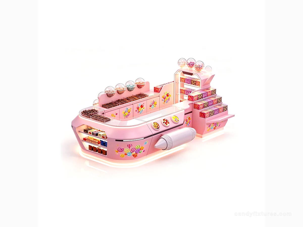
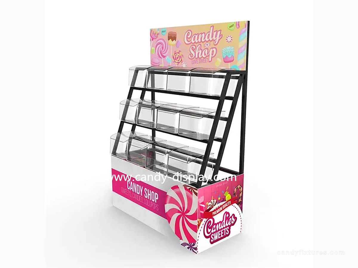
Divide the shop into clear customer and staff zones
Most candy stores can be organized into an arrival zone, a core browsing zone, a feature or seasonal zone, a service zone and a reserve-stock zone. The boundaries can be visual rather than architectural. A change in fixture height, color, lighting or floor position can tell customers that they have moved from one type of activity to another.
The arrival zone should be easy to read from outside. It can show the store promise, the most recognizable product or a seasonal campaign. Keep enough open space around the entrance for customers to pause without forming an immediate blockage. In a small store, a low first display is often more useful than a tall cabinet that hides the rest of the shop.
The core browsing zone should carry the products that make the store commercially reliable. Group by shopper logic rather than by the supplier's internal catalog: gummies, chocolate, novelty items, gifts, bulk candy or seasonal products may each need a different presentation method. Use signs and color blocks to make the grouping visible from a distance.
The service zone should include everything that happens at the transaction. If the store weighs bulk candy, allow room for the scale, bags, labels and a place to set the customer's order. If the store sells gifts, include wrapping and handoff space. If the shop is a kiosk, the counter must protect staff movement while remaining open to customers from the intended approach directions.
- Place the first high-impact message where approaching shoppers can understand it in a few seconds.
- Use the middle of the shop for browsing and comparison, not only for decoration.
- Keep service equipment and reserve stock close enough for staff to work without crossing the main aisle.
- Use a feature display to create a destination inside the store, then support it with quieter, easy-to-shop fixtures.
Choose a layout pattern that matches the store format
Layout patterns are useful starting points, but they are not templates to copy without checking the site. A wall-led plan gives a small shop a continuous merchandising surface and leaves the middle open. A grid or gondola plan increases product density and works when customers need to compare many packaged products. An island plan creates a strong central feature but must be tested against circulation and replenishment. A hybrid plan combines these approaches and is often the most flexible option.
For a mall kiosk, think in elevations as well as in plan view. A customer may approach from the front, side or rear, so each face should have a job: brand recognition, product display, service, storage or a visual feature. The layout should make it obvious which side is open for interaction and which side is protected for staff work.
| Pattern | Best fit | Main risk to check |
|---|---|---|
| Wall-led | Small shops and narrow footprints | Customers may miss products placed away from the entry sightline |
| Grid or gondola | Broad packaged assortment and comparison shopping | Aisles can feel dense if fixture depth and signage are not controlled |
| Central island | Feature collections, seasonal launches and destination browsing | The island can interrupt the route or hide lower-priority products |
| Kiosk or walk-around | Malls, atriums and open retail environments | Every approach direction needs a clear visual and service answer |
| Hybrid | Stores with both packaged and bulk or gift categories | Different fixture types can make the shop feel visually fragmented |
Plan bulk candy displays around refill and cleaning
Bulk candy is highly visual, but the layout must support more than color. Customers need to see the product, understand the name or price, use the scoop or dispenser and complete the purchase without reaching across another shopper. Staff need to refill containers, remove damaged product and clean contact surfaces without emptying the whole display.
Place the bulk station where it can be supervised without making the entrance feel like a queue. Group products by a clear shopper rule such as flavor family, texture, color or price band. Keep labels close to the corresponding container and make the refill path different from the customer reach path wherever possible.
The final container and food-handling setup should be reviewed against the applicable local requirements. The FDA Food Code is a model for retail food protection, not a universal approval for a particular store. Treat the layout as a coordination document for the designer, supplier and local authority rather than as a compliance decision by itself.
Protect the customer route and the staff route
A candy store can feel crowded before it is technically full. Tall displays, deep counters, open cartons, queue lines and decorative props all compete for the same floor. Draw a customer route and a staff route with the fixtures in place, then test the busiest moment: two shoppers browsing, one person paying, one staff member refilling and another person entering.
Accessibility also belongs in this test. ADA.gov describes accessible routes and walking surfaces for covered facilities in the United States, while the exact requirements for a project depend on the location and scope. As a practical design habit, keep the intended route continuous, avoid placing display props in turning areas and review the service counter as part of the same path rather than as a separate object.
Safety and comfort are not only legal questions. A clear route makes the store easier to understand, easier to clean and less stressful during busy periods. It also gives the visual design more space to work because each feature has room around it.
Make a small candy shop feel larger
Small-space design is mostly about protecting sightlines and reducing unnecessary depth. Use the wall height carefully, but keep the first layer of the shop open enough that shoppers can see the main offer from the entrance. Combine a few taller feature units with lower tables, counters or bins so the eye can move through the store.
Use one repeatable organizing rule for the core assortment. Too many colors, shapes and sign styles make a small store feel smaller. A consistent shelf rhythm, clear labels and a limited finish palette can make a compact fixture system feel intentional even when the products are playful.
For a small kiosk, prioritize surfaces that work from multiple directions. A themed counter or walk-around display can create more value than several narrow units that only face one side. Confirm the mall's sightline, electrical and delivery rules before finalizing the shape.
Test the layout before production
Before approving custom fabrication, test the layout with a scaled drawing, simple floor tape or a basic 3D view. Walk the customer route and the staff route. Pretend to refill the most frequently purchased products. Stand outside the entrance and check what is visible first. Try the busiest expected transaction and look for points where people stop in the wrong place.
Then review the fixture schedule. Each unit should have a clear reason to exist, a product group, a location and a refill responsibility. If a unit has no product or operating role, it may be decoration that should be evaluated separately. If two units do the same job, compare them on capacity, visibility, cost and installation complexity.
A good layout is ready for change. Leave a sensible place for seasonal collections, promotional tables or a new product category. The goal is not to freeze the store forever; it is to give the first operating year a structure that can be measured and improved.
- Check the entrance view from every normal customer approach.
- Walk a full basket or bulk-candy journey from entry to payment and exit.
- Test staff access to reserve stock, cleaning points and service equipment.
- Confirm that feature displays do not hide the core assortment or signs.
- Record which dimensions are fixed and which can change before production approval.
Related products and planning pages
Candy Boat Kiosk Pink Candy Counter Sweet Retail Store Bar Candy Spaceship DisplayBack-to-back candy display racks are used in retail stores & malls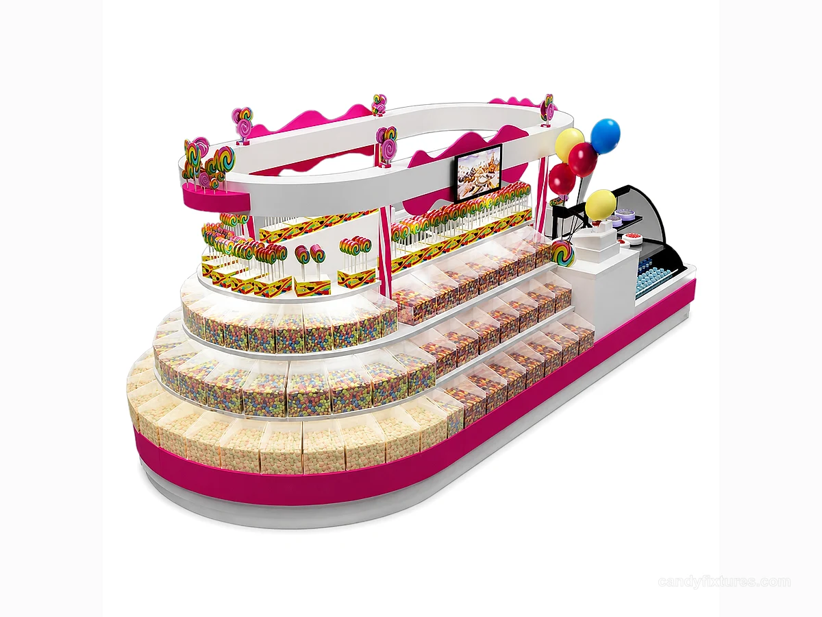 Boat Shape High-end Shopping Mall Candy & Ice Cream Kiosk Custom
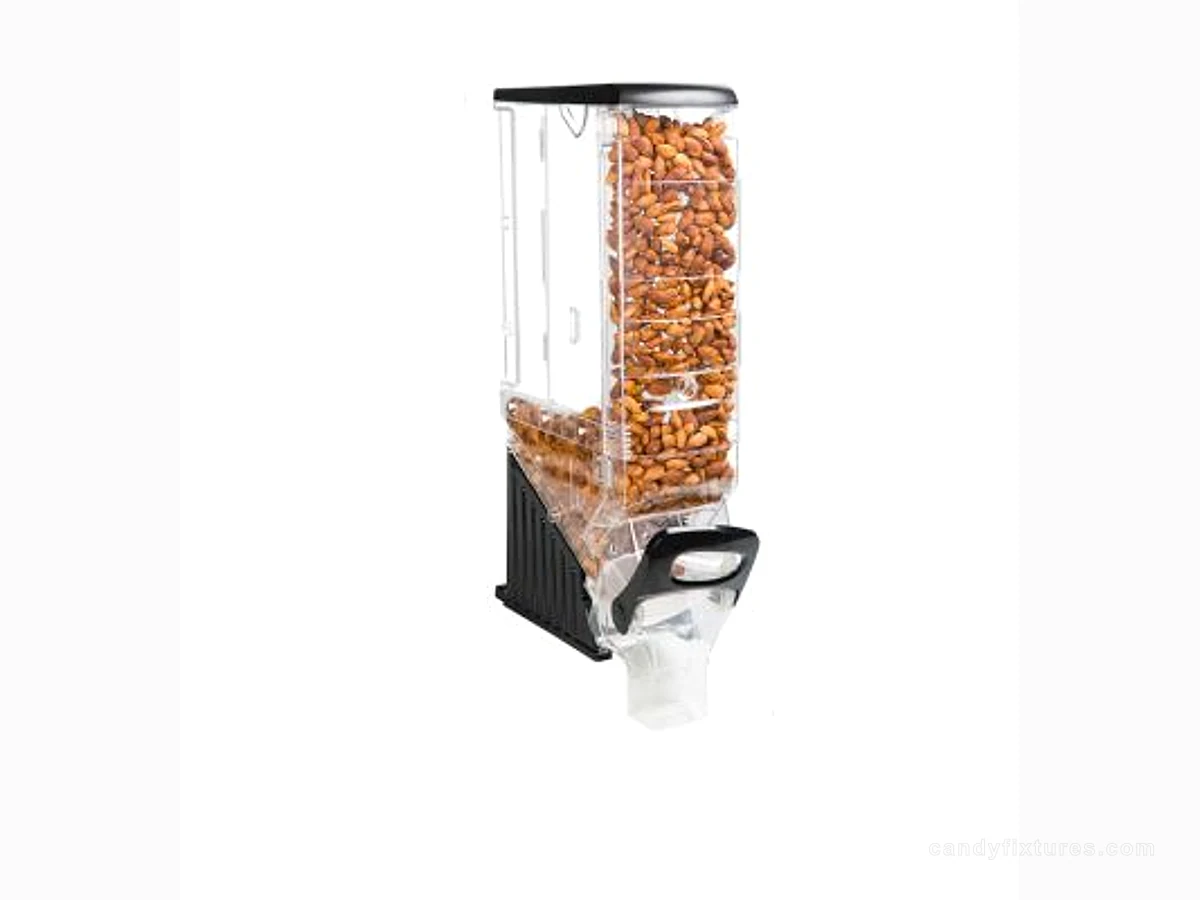 Supermarket Candy Store Wall-mounted Dispenser Nuts Bulk Candy Drop-down High Transparent Gravity Food BoxCandy store fixturesBrowse the wider fixture and container collection.How to open a candy storeStart with the broader opening and operating plan.
Frequently asked questions
What is the best layout for a small candy store?
A wall-led or hybrid layout is often a useful starting point because it protects the middle of the shop for circulation while still giving the assortment enough display length. The final choice depends on the entrance, product mix, service method and fixed obstacles.
Where should the checkout go in a candy store?
Place the checkout where staff can see the store and customers can find it without crossing the main browsing route. Leave room for bags, weighing, gift wrapping or order handoff, and test the queue during the busiest expected moment.
How should I plan a bulk candy display?
Group products by a clear shopper rule, keep labels close to containers, separate customer reach from refill work where possible, and confirm the container, cleaning and food-handling requirements that apply in the project location.
Should a candy store use custom display racks?
Custom racks are useful when the store needs a special footprint, brand shape, product capacity, service opening or coordinated finish. Standard or modular racks may be more efficient when they already fit the assortment and site constraints.
Sources and further reading
- U.S. Food and Drug Administration — FDA Food CodeUsed to frame local food-protection review for bulk and retail food handling.
- ADA.gov — 2010 ADA Standards for Accessible DesignUsed for the recommendation to review accessible routes and walking surfaces during layout planning.
- U.S. Access Board — ADA Accessibility StandardsUsed as a neutral reference for accessibility planning; project-specific requirements still need local review.
Regulatory requirements vary by location. Confirm the final layout, food handling and accessibility requirements with the relevant local professionals before construction or opening.