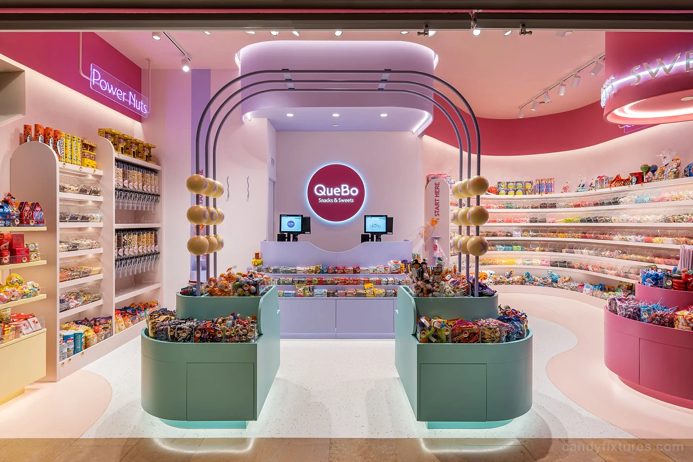
What the project image shows
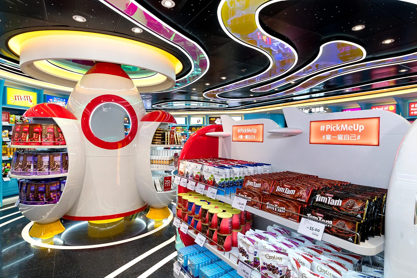
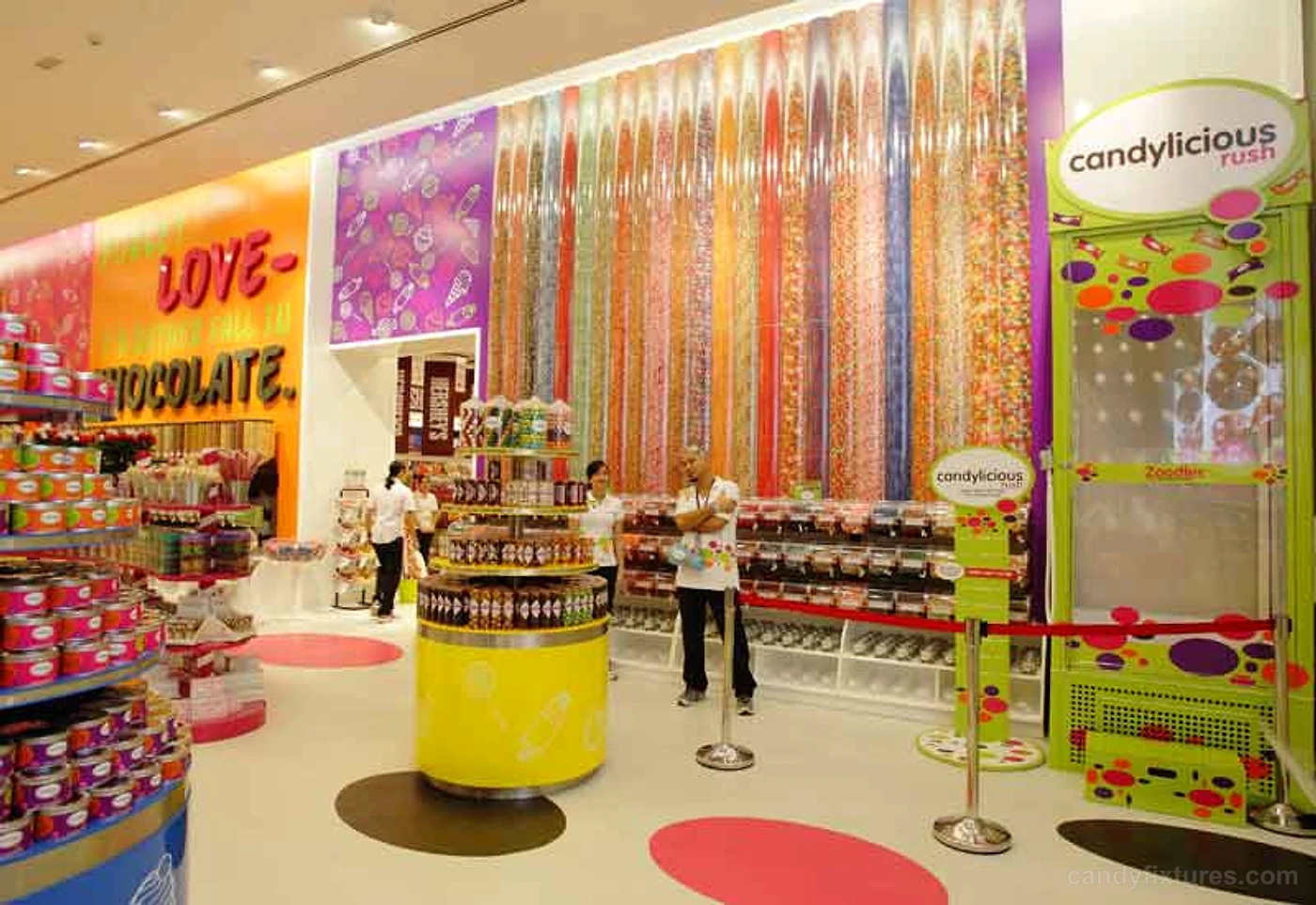
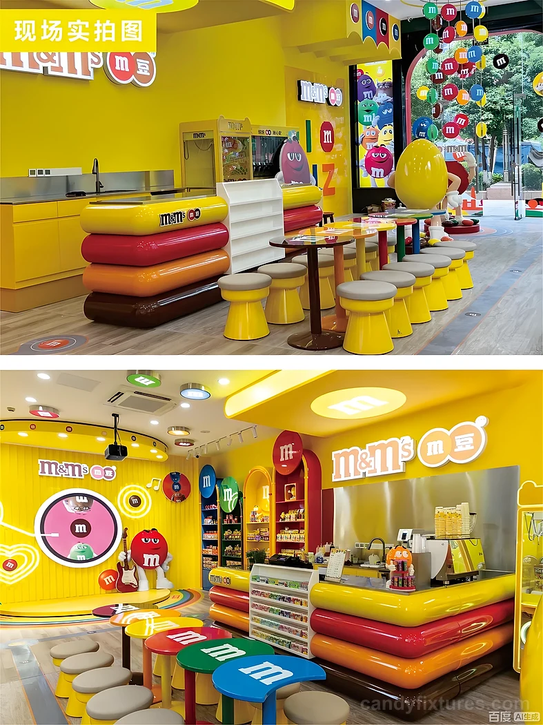
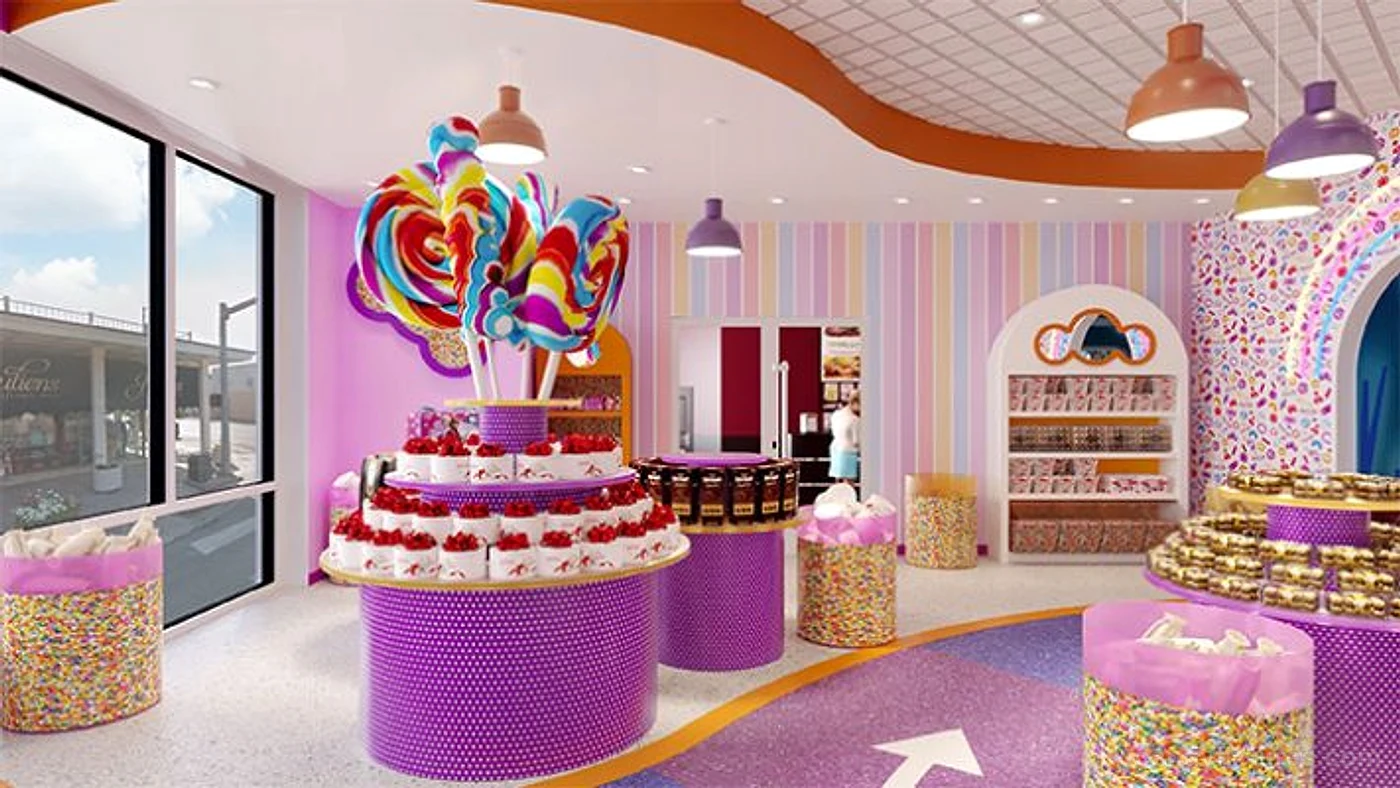
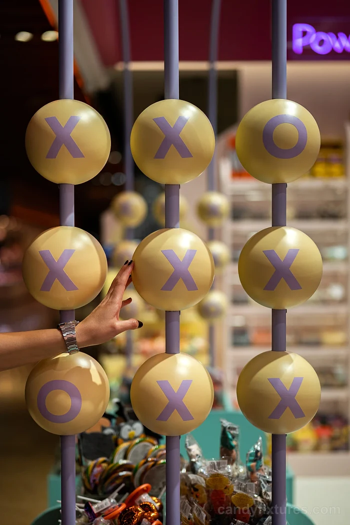
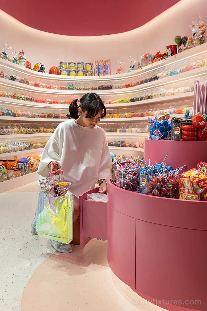
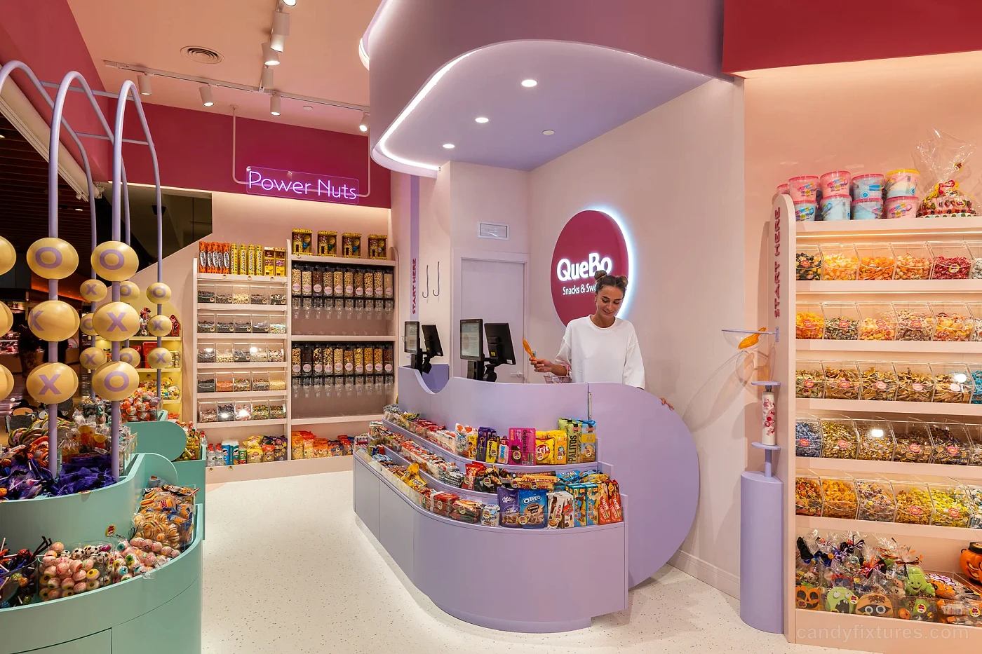
In A Candy Store Designed Like a Fairy Tale, the lead image presents a pink and red retail environment where integrated display lighting, a visible glass storefront, and custom candy-themed sculptures are visible as parts of one store concept. This visual evidence informs the description; dimensions, materials, and operating details are only stated when they are supported by the project record.
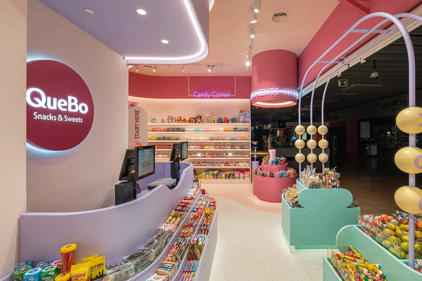
Project Overview
In section 02 of A Candy Store Designed Like a Fairy Tale, this part of the proposal brings a visible glass storefront together with custom candy-themed sculptures. We review it for product visibility, customer reach, cleaning access, staff use, and fabrication constraints, then confirm the final dimensions and finishes through drawings and samples prepared for the project.
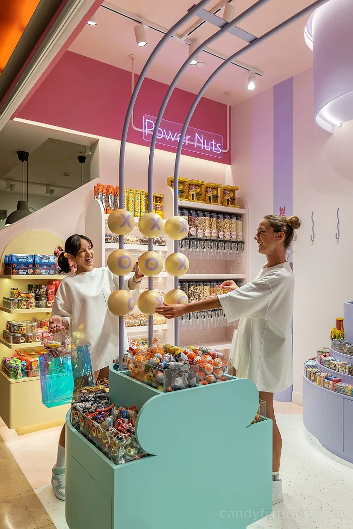
Space Planning
In section 03 of A Candy Store Designed Like a Fairy Tale, this stage organizes custom candy-themed sculptures in relation to integrated display lighting, using the customer approach and the actual floor plan as constraints. Display zones are positioned to stay visible without tightening the main route, while staff clearances and replenishment access are checked separately before the layout is approved.
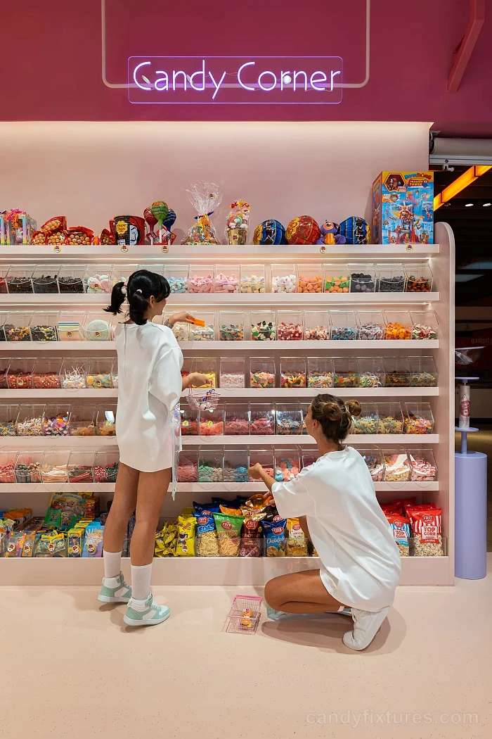
Display Fixture Strategy
In section 04 of A Candy Store Designed Like a Fairy Tale, the fixture family gives integrated display lighting and a visible glass storefront a consistent visual language while allowing each unit to perform a different merchandising role. Shelf spacing, bin access, edge profiles, lighting, and concealed storage are developed from the intended products and the capacity target for this project.
Project Highlights
- integrated display lighting
- a visible glass storefront
- custom candy-themed sculptures